Translating Photographs
Hopkins Center 3
Posters
Project Description
Charles Gibson’s involvement with the Hopkins Center Graphic Design Studio spanned two decades– as assistant designer under Mark Friedman from 1972-1974 and as design director from 1979-1987. Responsibilities included: design and implementation of season brochures; posters for the performing arts, film society, and Artist-in-Residence Program; print advertising; lobby/kiosk displays; fundraising pieces; and special projects. Prior to the opening of the Hood Museum of Art in 1985, Charles Gibson also designed invitations, posters, and exhibition catalogs for the Center’s galleries.
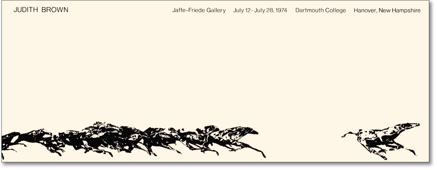
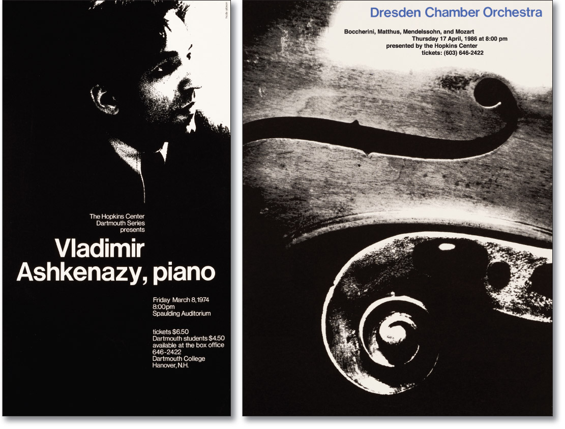
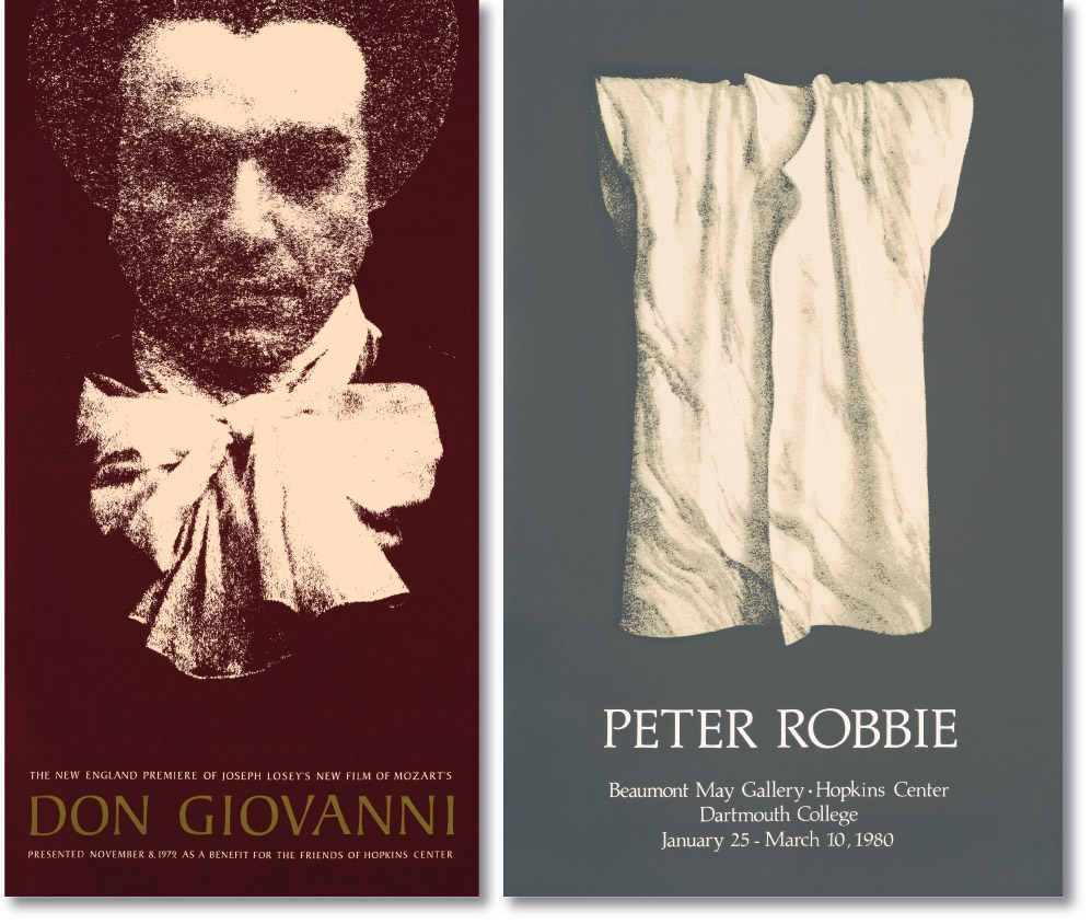
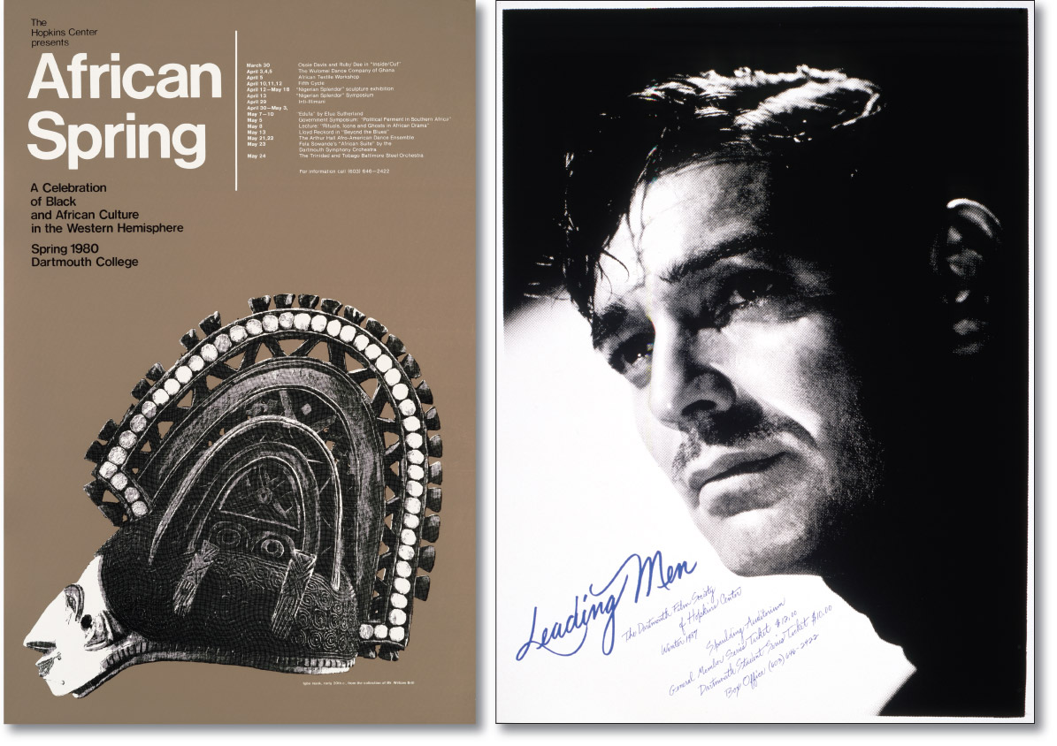
In the photosilkscreen medium, photographs cannot be reproduced as continuous tone images with the range of gray tones made possible by offset lithography and digital printing. To interface successfully with the relatively coarse mesh of the silkscreen, a continuous tone photographic print must first be “translated” into either a high contrast or coarsely screened image. If the original is a reproduced, pre-screened photograph, it must be enlarged three or four times to produce half tone dots that are larger than the silkscreen’s mesh.
This limitation, however, turns out to be one of the medium’s great strengths. High contrast, coarsely screened, and enlarged half tone photographs, when juxtaposed with type and /or other image modes, generate powerful graphic communications.


