An Evolving Identity
Bike Track, Inc.
Woodstock, Vermont
Logo and Stationery Program
Project Description
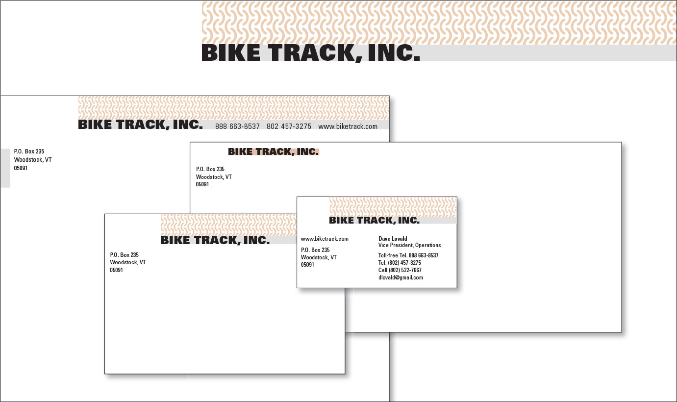
The principles that guide the creation of good corporate identity ensure that an excellent logo or symbol will possess an integrity that will stand the test of time. However, just as a company evolves over time in response to changes in the marketplace and internal changes in the vision of its principals, so to may the company’s corporate identity.
In its early years, Bike Track, Inc. focused on the marketing and distribution of proprietary bicycle storage systems and outdoor ground coverings for civilian and military use. Each of the company’s products was conceived to make a positive contribution to the environment– from the promotion of bicycling to the maintenance of hiking trails and ground cover.
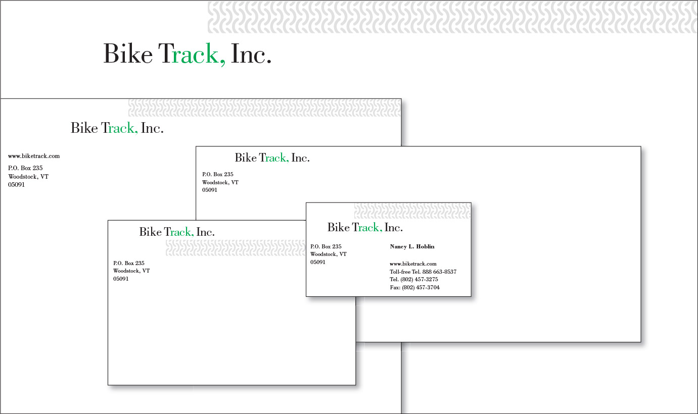
CGD responded to Bike Track’s request for a logo with an economical typographic solution that sends two messages in addition to the name itself. A simple change in color exposes the word “rack”, alluding to the bicycle rack, originally one of the company’s core products. At the same time, the accent color evokes the “green movement”.
In the stationery and web site applications, the logo’s signals are augmented by a texture derived from the company’s other major product line, EcoTrack Tiles.

