What do the Letters A, H, I, M, O, T, U, V, W, X and Y have in Common?
Elliot Hospital
Manchester, New Hampshire
Campus and Interior Wayfinding Program
Project Description
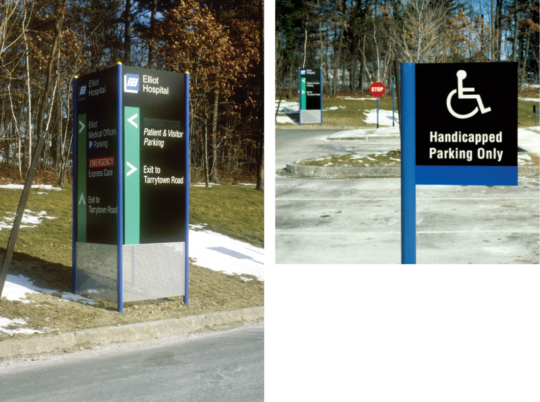
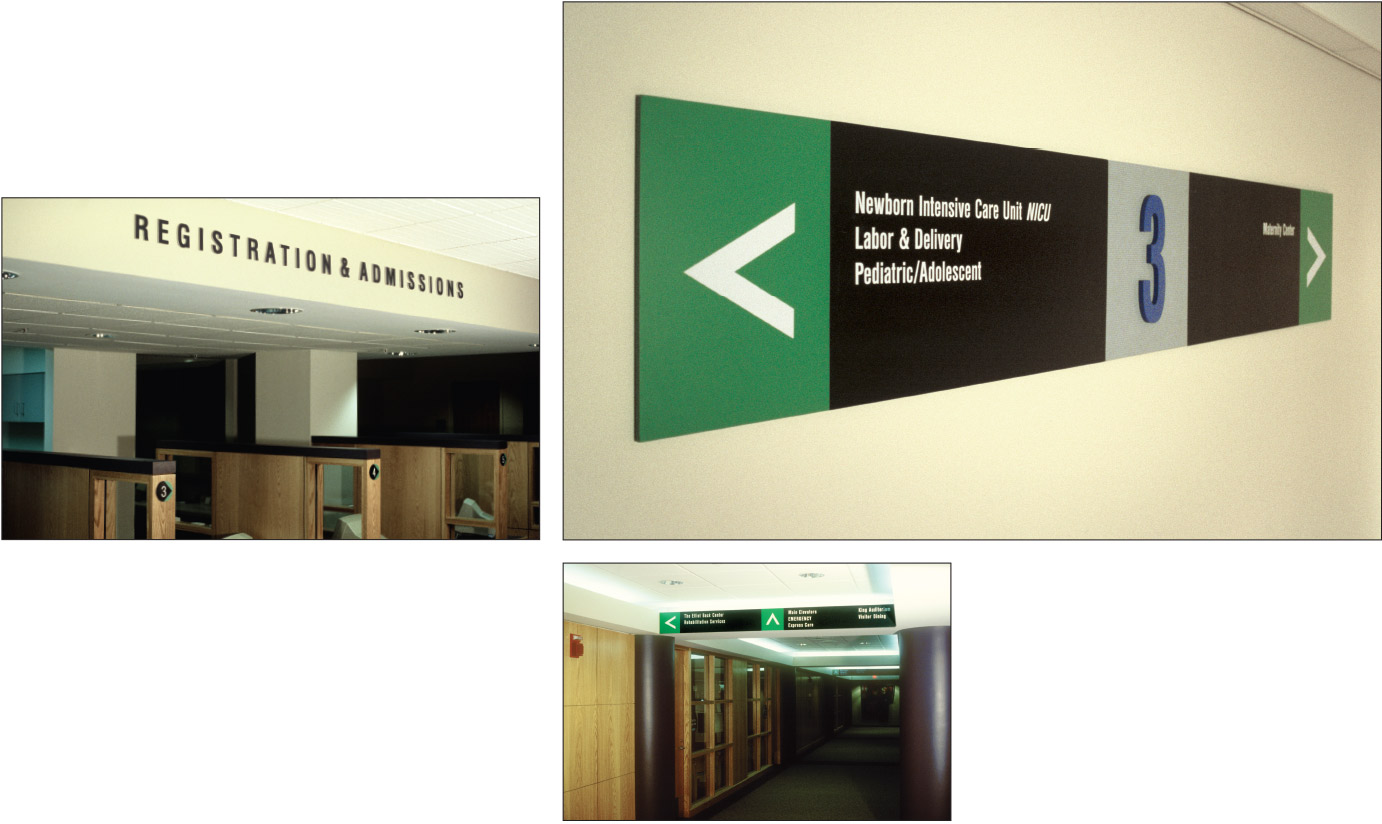
Charles Gibson Design collaborated with Gamble Design and JSA Inc. Architects of Portsmouth, NH in the design of a comprehensive sign program for Elliot Hospital’s renovated Manchester campus and new JSA-designed wing.
Close collaboration among the design principals, with Hospital staff, and with the sign fabricator, Design Communications, Ltd. of Boston, produced a sign program responsive to the unique nomenclature and wayfinding needs of southern New Hampshire’s premier provider of health services. Clear typography, functional use of color, and innovative sign structures interact with the architecture and vehicular circulation to create a patient and visitor-friendly environment.
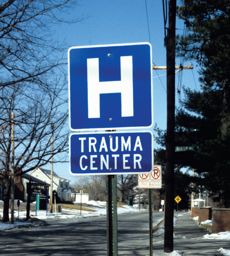
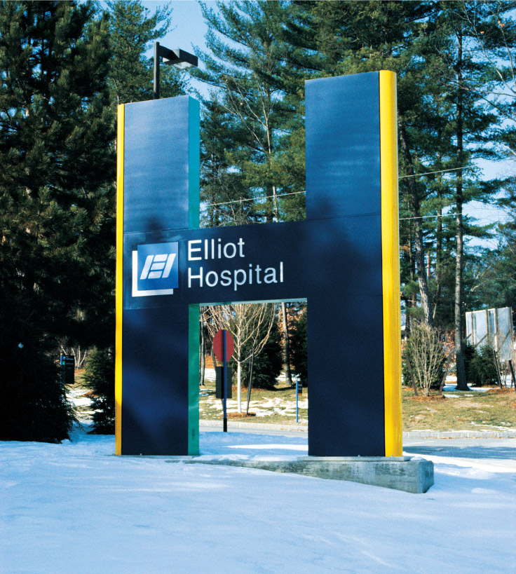
A prominent feature of the Elliot program is the landmark entry sign, a 14-foot internally-illuminated letter H. By establishing a semantic link between the ubiquitous blue and white letter H of D.O.T. road signage and the hospital’s identity, this sign assures the visitor of an unmistakable sense of arrival.
Configuring the main entry sign in the form of a double-sided H, thereby allowing it to be correctly read from both directions of the main access road, was made possible by the letter’s symmetry, a quality it shares with ten other upper case letters in the Roman alphabet.