Type as Image
Hopkins Center 1
Dartmouth College
Posters
Project Description
Charles Gibson’s involvement with the Hopkins Center Graphic Design Studio spanned two decades– as assistant designer under Mark Friedman from 1972-1974 and as design director from 1979-1987. Responsibilities included: design and implementation of season brochures; posters for the performing arts, film society, and Artist-in-Residence Program; print advertising; lobby/kiosk displays; fundraising pieces; and special projects. Prior to the opening of the Hood Museum of Art in 1985, Charles Gibson also designed invitations, posters, and exhibition catalogs for the Center’s galleries.
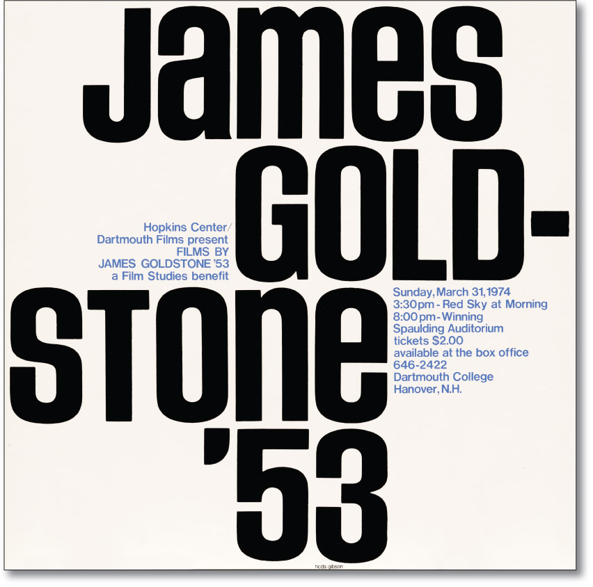
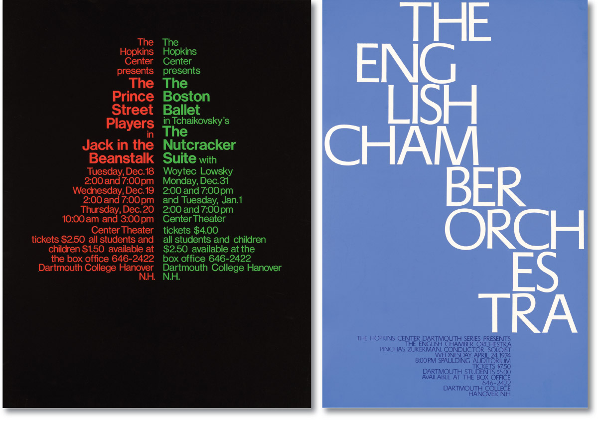
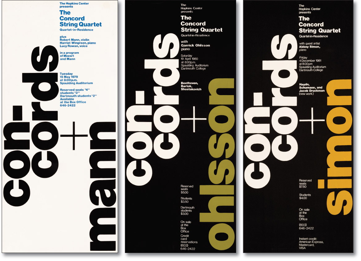
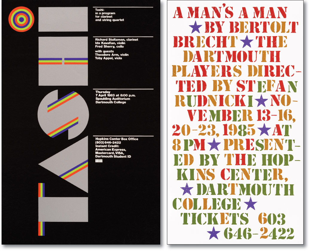
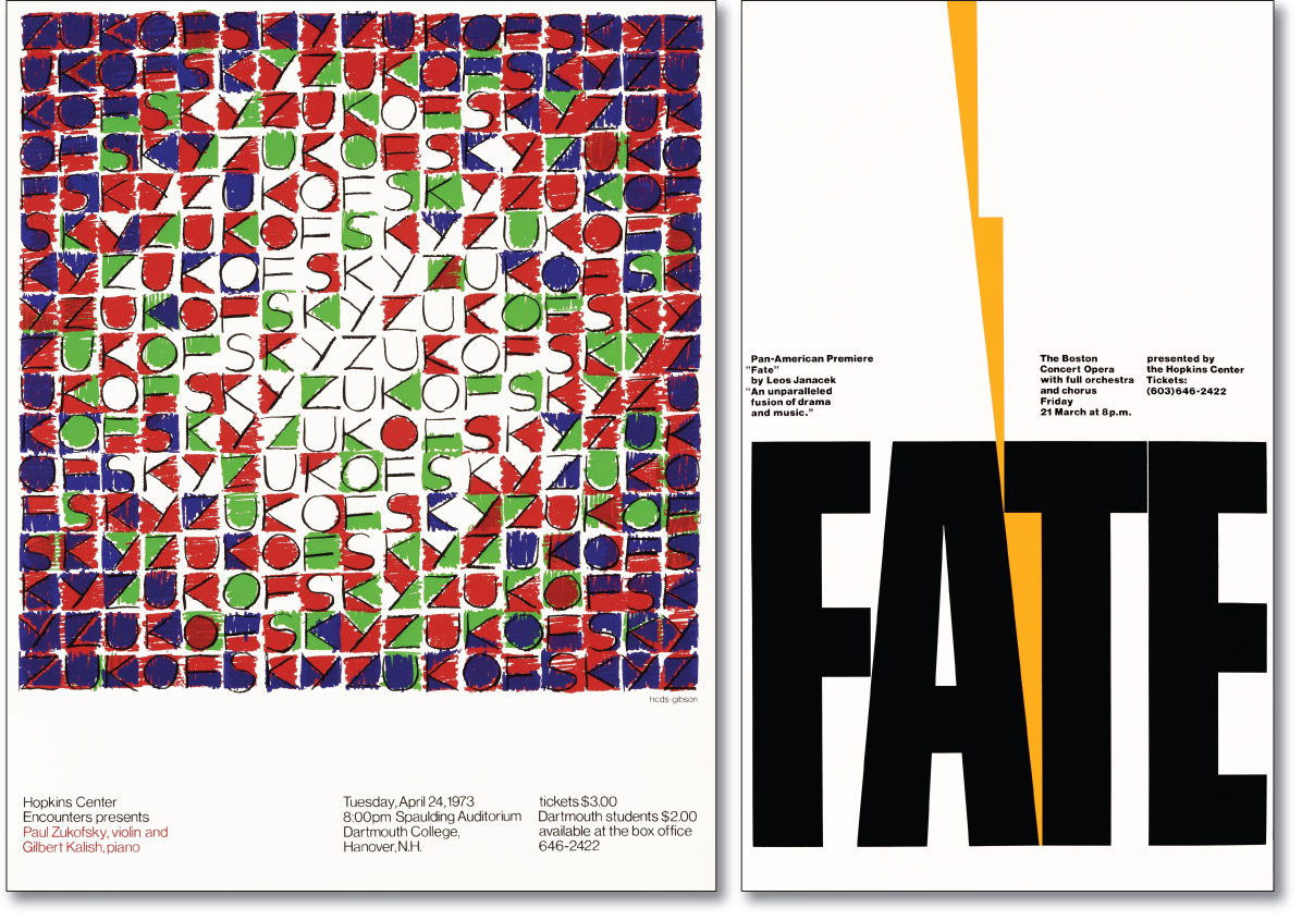
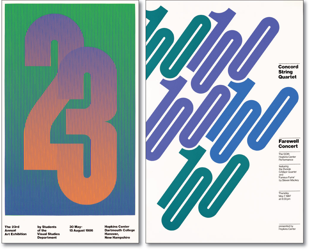
While image and type can interact successfully, there are times when an all-type approach offers the best solution. Type not only communicates verbally, but it can be the image as well.
This group of posters explores the potential of a letterform’s intrinsic qualities to generate engaging graphic structures. Positive/negative relationships are developed as dominant themes in the “James Goldstone ’53”, “FATE”, “23rd Annual Art Exhibition”, and “Concord String Quartet” posters. Typographic shape and texture generate abstract energy in the “English Chamber Orchestra”, “Concords+” series, “A Man’s a Man”, and “Paul Zukofsky” posters. In the “Prince Street Players”/“Boston Ballet” poster, shape, texture, and color create seasonal associations. In the “TASHI” poster, a custom font is pushed to its geometric limits.
